Packaging Design For
A Modern Wellness System
A clean, inclusive visual identity and packaging system designed to bring clarity to reproductive health supplements.
Dame Health
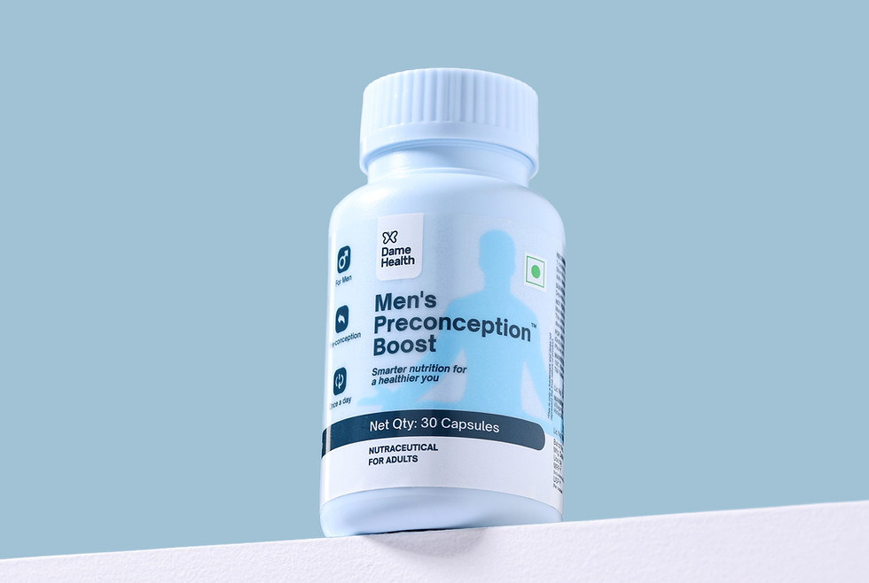
Dame Health is a modern supplement brand focused on reproductive wellness across genders—balancing science, sensitivity, and everyday usability.
About
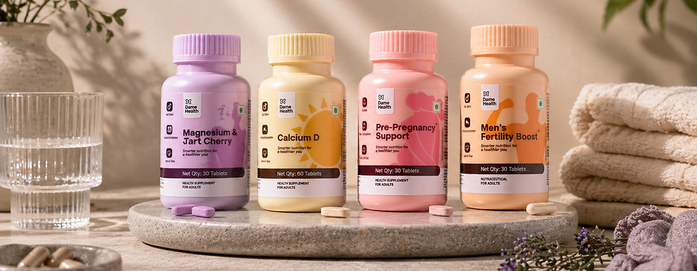
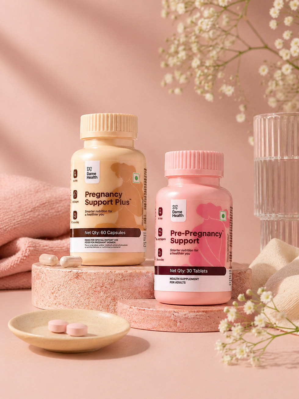
In a category often defined by discomfort or over-clinical design, Dame Health takes a more thoughtful approach to reproductive wellness.
This project focused on creating packaging and a design system that feels clear, inclusive, and quietly confident—designed for real people and real conversations.
Design Approach
To design it like it belongs in everyday life.
-
Moving away from “medicine” cues → no harsh layouts, no intimidating visuals
-
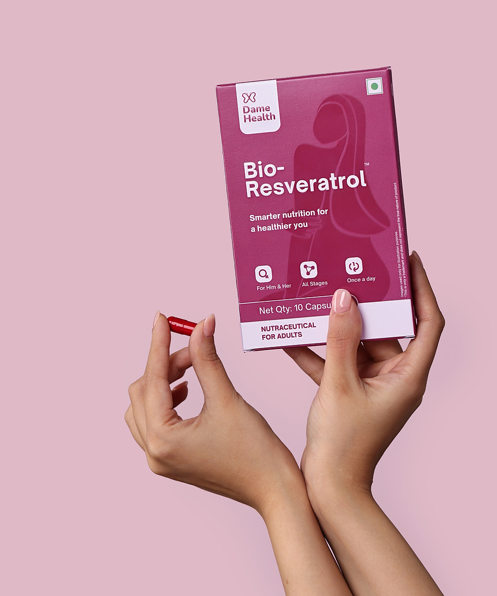
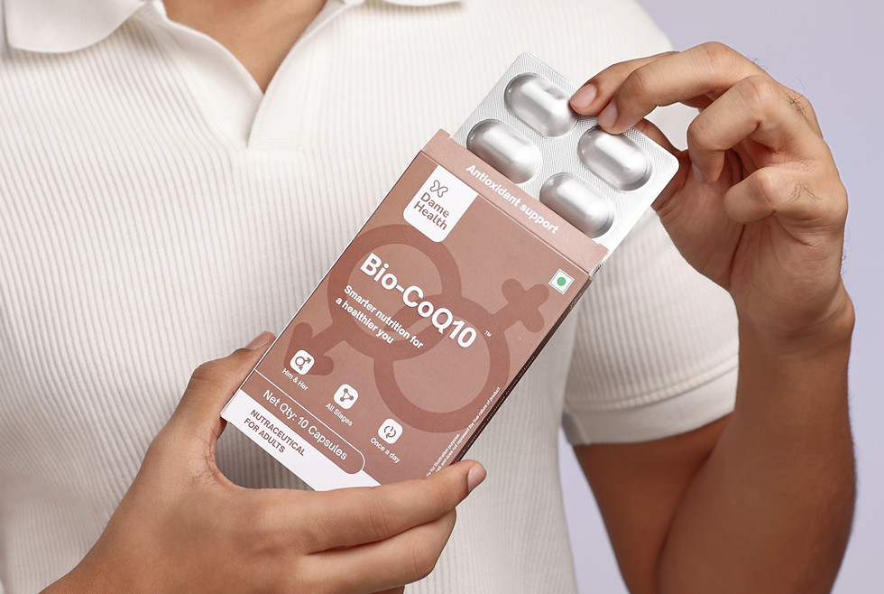
Built a gender-neutral yet emotionally intelligent system
-
Balanced pharmaceutical credibility with warmth
-
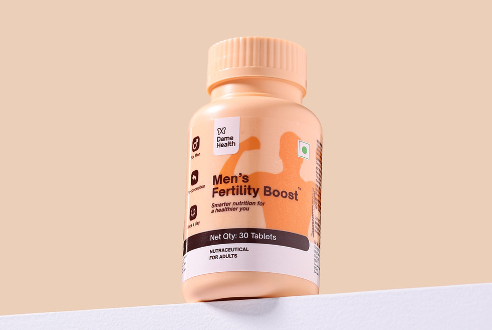
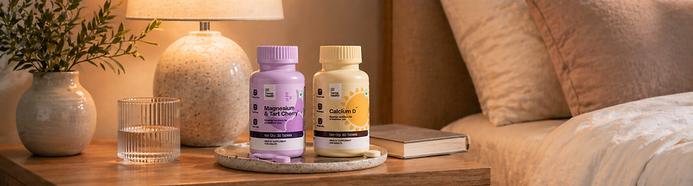
Designed for clarity, comfort, and confidence by using calm colours with minimal forms
The goal wasn’t to make it louder or softer—but to make it feel normal enough to be left out, and clear enough to be trusted.
The Problem
Reproductive health is either over-clinical or over-sanitised—there’s no in-between. It comes with hesitation.
It’s the pause before picking it off a shelf. The instinct to hide it.
Packaging feels like medicine—loud, clinical, and exposing. Not something you’d leave out in the open. Not something you’d reach for comfortably. What should feel like self-care ends up feeling… awkward.
It's a category that’s essential — yet designed to be avoided.
Insight
The discomfort wasn’t the product—it was how it was presented.
When it looks like medicine, it feels like something is wrong. This wasn’t just a packaging problem— it was a perception problem. Reproductive health didn’t need to be hidden or softened. It needed to feel normal, everyday, and quietly confident.