Packaging Design for Playful Beginnings
Turning a baby care essential into something soft, playful, and impossible to ignore on the shelf.
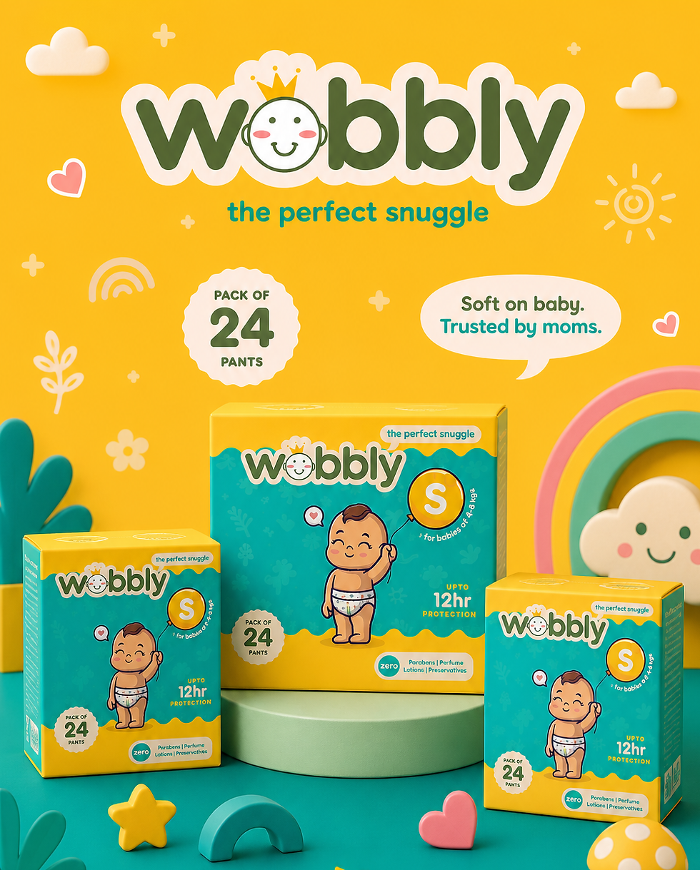
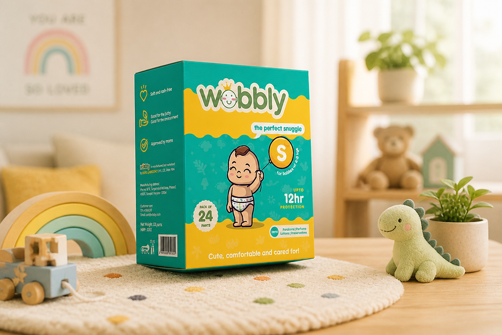
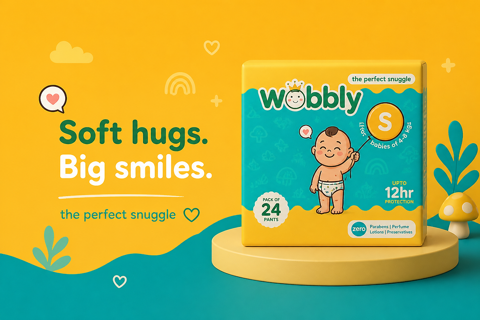
Wobbly
Wobbly is a playful, feel-good kids’ brand designed to make everyday essentials more joyful and engaging.
It blends care with creativity, turning routine moments into little bursts of fun.
About
The project focused on designing a packaging system that feels as lively and comforting as the brand itself.
The approach combined soft, friendly visuals with a sense of movement and play, creating an identity that instantly connects with both kids and parents.
From colour choices to illustration style, every element was crafted to balance trust with delight—making the product stand out while still feeling gentle, safe, and approachable.
We made the brand Wobbly—in the best way possible.
• Soft, bouncy forms that feel alive (almost like they’re giggling)
• A colour palette that’s cheerful, not chaotic
• Friendly illustrations that spark curiosity, not clutter
• Subtle cues of care and calm, wrapped in playfulness
Because when it looks like fun, it becomes fun.
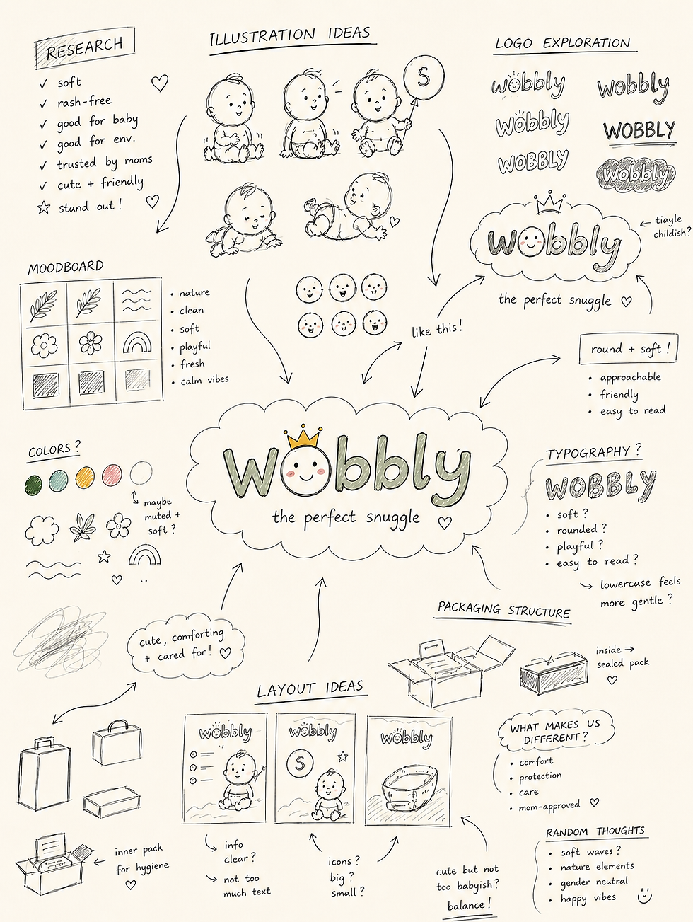
Design Approach
The Problem
Kids don’t care about “wellness”—they care about fun.
But most kids’ products look either too clinical (read: boring) or too loud (read: overwhelming).
Somewhere between “medicine vibes” and “sugar-rush chaos,” the joy gets lost—and so does the connection.
Insight
If it makes them smile, they’ll reach for it.
Kids are drawn to personality, movement, and play—and parents are drawn to trust and softness.
The sweet spot? A world where fun feels safe and care feels like play.