
Beyond Branding:
Blond, Bold & Baked
Not just baked goods— a little chaos, a little charm, and a whole lot of personality.


Blond Bakery
Blond Bakery is a contemporary dessert brand built on curiosity and character. It blends classic baking with unexpected twists, creating products that feel fresh, distinctive, and full of personality.
With a focus on thoughtful presentation and evolving offerings, Blond positions itself as more than a bakery—it’s a space where indulgence meets identity.
About
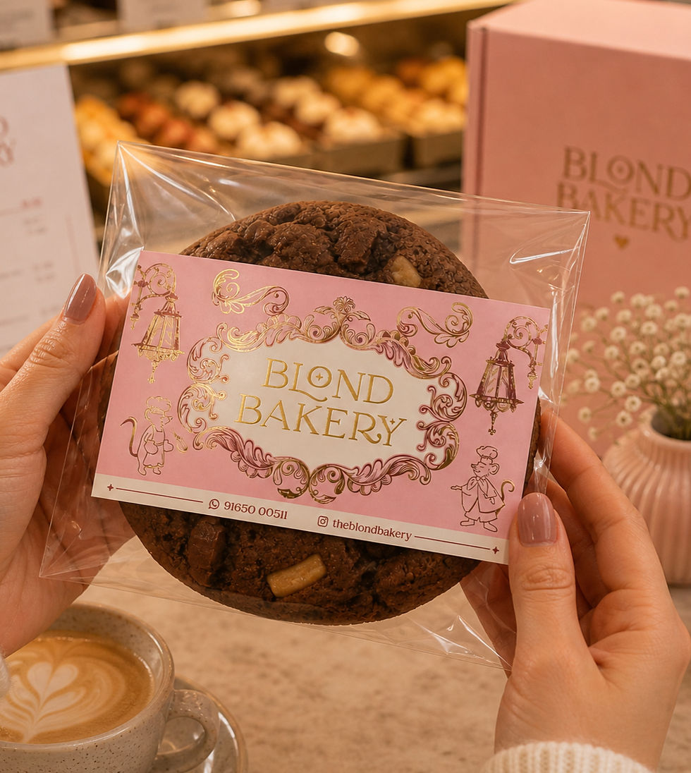
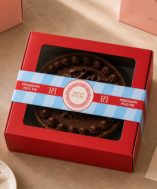
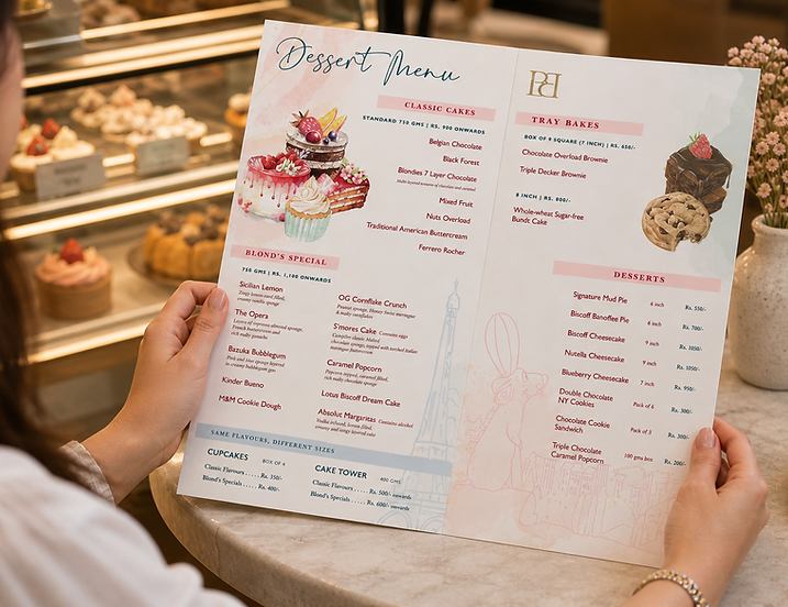
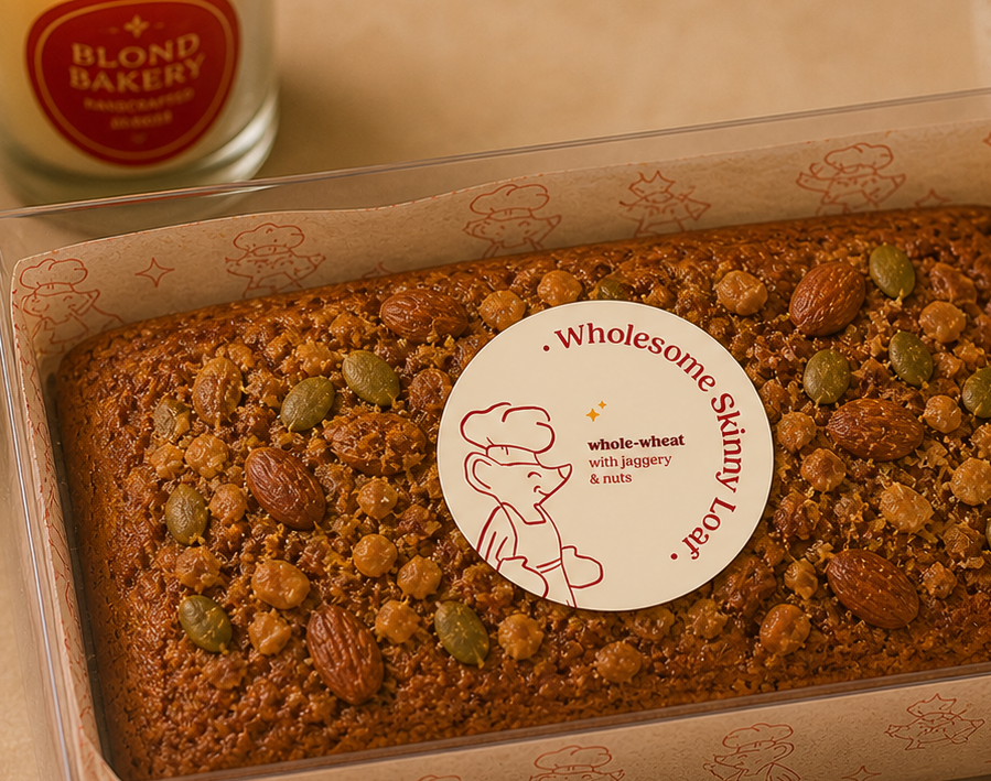
The Blond Bakery project focused on building a brand that feels fresh, distinctive, and full of character. The visual identity balances contemporary design with expressive elements, creating a cohesive yet dynamic language across touchpoints—one that feels intentional, warm, and instantly recognisable.
The scope spanned packaging design, label systems, menu design, and marketing collaterals, along with a signature newspaper-style collateral for the bakery launch that adds a unique storytelling layer. Each element works both independently and together, allowing the brand to stay consistent while evolving and experimenting visually.

The Outcome
The result is a distinctive, system-led brand identity that balances structure with flexibility—allowing Blond Bakery to stay consistent while evolving across formats and experiences.
-
Strong, recognisable presence across touchpoints
-
Cohesive system adaptable to new formats
-
Elevated shelf and visual recall
-
Seamless integration of print and packaging
-
Scalable design language for future expansion
-
A brand that doesn’t just sit on the shelf—
it stays with you.
Visual Language & Design Approach
A flexible visual system was developed to ensure consistency without rigidity. Bold typography, structured layouts, and minimal yet striking elements come together to create a recognisable identity.
The system allows the brand to shift between playful and refined, depending on the context, while still feeling cohesive at every touchpoint.
Process & Insights
The approach began with understanding the brand’s experimental nature and translating it into a visual language that feels effortless yet intentional.
The key insight was to treat every element—from packaging to the newspaper-style collateral—as part of a larger narrative, allowing the brand to stay cohesive while continuously evolving.

