A Palette of
Periwinkle Indulgence
Where gentle hues meet decadent details— crafting a visual language that tastes as soft as it feels.


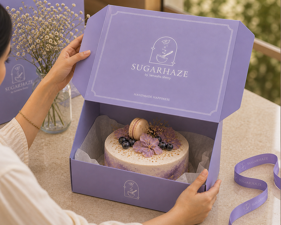

Sugarhaze
A bakery rooted in softness and subtle indulgence, the brand brings together delicate flavours and an even more delicate visual identity.
Built around a calming periwinkle palette, it feels light, dreamy, and quietly inviting—where every detail reflects a sense of warmth, comfort, and understated sweetness.
About
This project focused on creating a bakery identity that feels soft, refined, and quietly indulgent. Moving away from loud, sugary visuals, the design was built around a calming periwinkle palette—defining the brand’s mood across logo, packaging, and collaterals. The approach balanced charm with minimalism, resulting in a cohesive identity that feels light, modern, and effortlessly appealing.

Brand Essence
Soft indulgence at its core—the brand is built on the idea of sweetness that feels light, calming, and comforting rather than overwhelming. It evokes a sense of quiet joy, where every interaction feels gentle, dreamy, and effortlessly delightful.
Visual Identity
Led by a signature periwinkle palette, the identity leans into soft pastels, clean compositions, and minimal detailing. Rounded forms, airy spacing, and subtle contrasts create a look that is both cute and refined—striking a balance between playfulness and sophistication.
Design Approach
Colour as emotion—using periwinkle to define mood and recall
-
Minimal yet expressive—keeping elements simple but intentional
-
Softness in detail—through forms, spacing, and composition
A thoughtful blend of restraint and charm shaped a cohesive identity that feels modern, distinctive, and quietly indulgent.

